


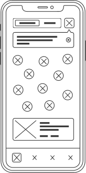
iOS

01
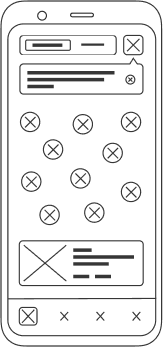
Android

02
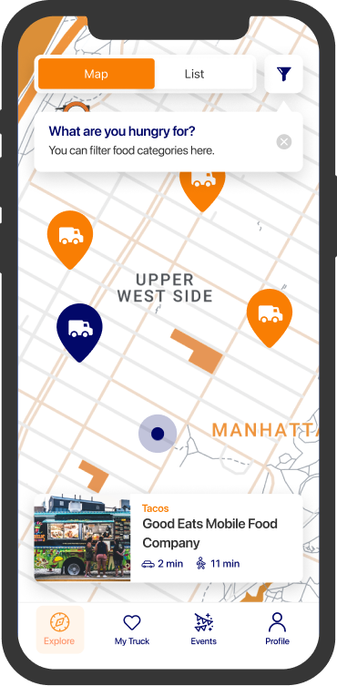
CONSUMER APP
Native apps for Foodtrux customers, with a fresh design and a smart, modern user interface. Made for discovering food trucks near your location and more.

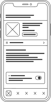
03

04
VENDOR APP
Simple and intuitive apps made for food truck owners. Used for creating truck profiles, tuning the location schedule and editing menus.
iOS
CONSUMER APP
Native apps for Foodtrux customers, with a fresh design and a smart, modern user interface. Made for discovering food trucks near your location and more.
01
Android
CONSUMER APP
Native apps for Foodtrux customers, with a fresh design and a smart, modern user interface. Made for discovering food trucks near your location and more.
02
iOS
VENDOR APP
Simple and intuitive apps made for food truck owners. Used for creating truck profiles, tuning the location schedule and editing menus.
03
Android
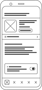
VENDOR APP
Simple and intuitive apps made for food truck owners. Used for creating truck profiles, tuning the location schedule and editing menus.