Custom Software Solutions
For many clients, seeing a product come to life through the design phase is the most exciting part of the project.
Our design methods are based on decades of experience and industry best practices.
We take a tailored approach to design so each engagement is unique to the needs of the client. There is no ‘cookie cutter’ approach to our design work.

Product Design

User Journeys
User journeys are paths users may take on their way to reaching their goal in your app or website. Needless to say that the quicker and easier these paths are, the better the product. There are countless options, but some paths are better than others. We are good at detecting these.
Lo-Fi Prototypes
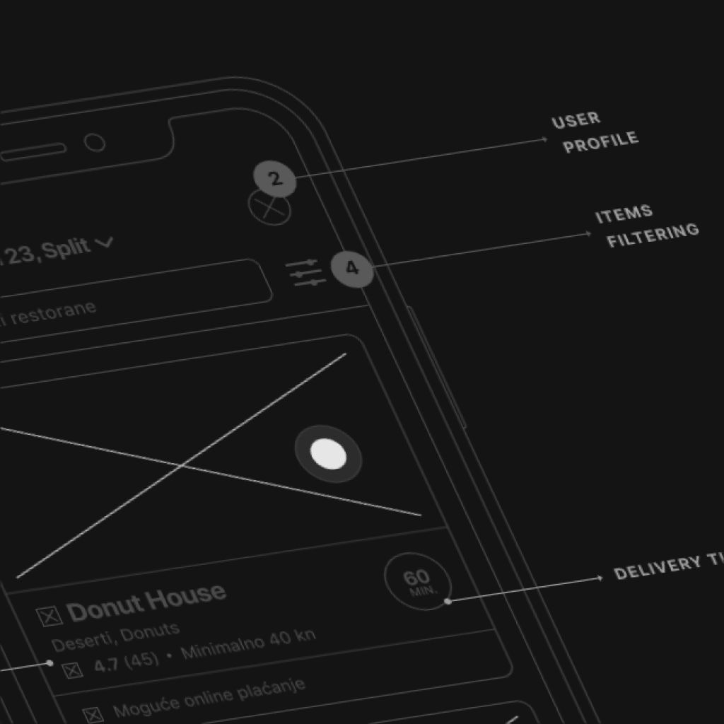
We need a way to translate high-level design concepts into tangible and testable artifacts. Enter lo-fi prototyping. It is used to check and test functionality rather than the visual appearance of the product. Commonly, it focuses on a particular piece of functionality and not on the overall app experience.

Moderated User Testing
A human operator facilitates a test and guides the participant, providing support and answering questions if the subject encounters challenges while completing tasks within the study. This is the kind of testing mostly used for lo-fi prototypes in an attempt to avoid any ambiguities.
User Experience Design

Information Architecture
We map out crucial information that needs to be included into the product. That gives us a blueprint of the design structure to be aggregated into wireframes and sitemaps of the project.
Wireframes
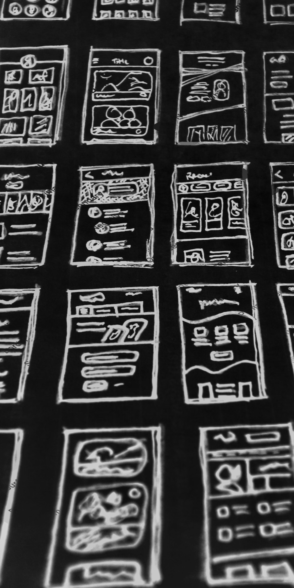
Designing a digital product at a structural level is called wireframing. A wireframe takes into account users’ needs and journeys and is commonly used to layout content and functionality of a page. Before any visual design or content is applied, we must use wireframes in order to establish the basic structure of a page.
Sitemap
The result of our efforts is a UX sitemap — a hierarchical diagram of a website or an application where everything is neatly prioritized, linked, and labeled.
User Interface Design
Research & Inspiration
It is important to keep up with trends and make sure a design won’t get outdated any time soon. Each industry has its own design specifics so users invariably and subconsciously expect us to follow the specs. With so many industries in the mix, self improvement needs to be a constant. If you don’t know what else is out there, how can you beat it?

Look & Feel Exploration
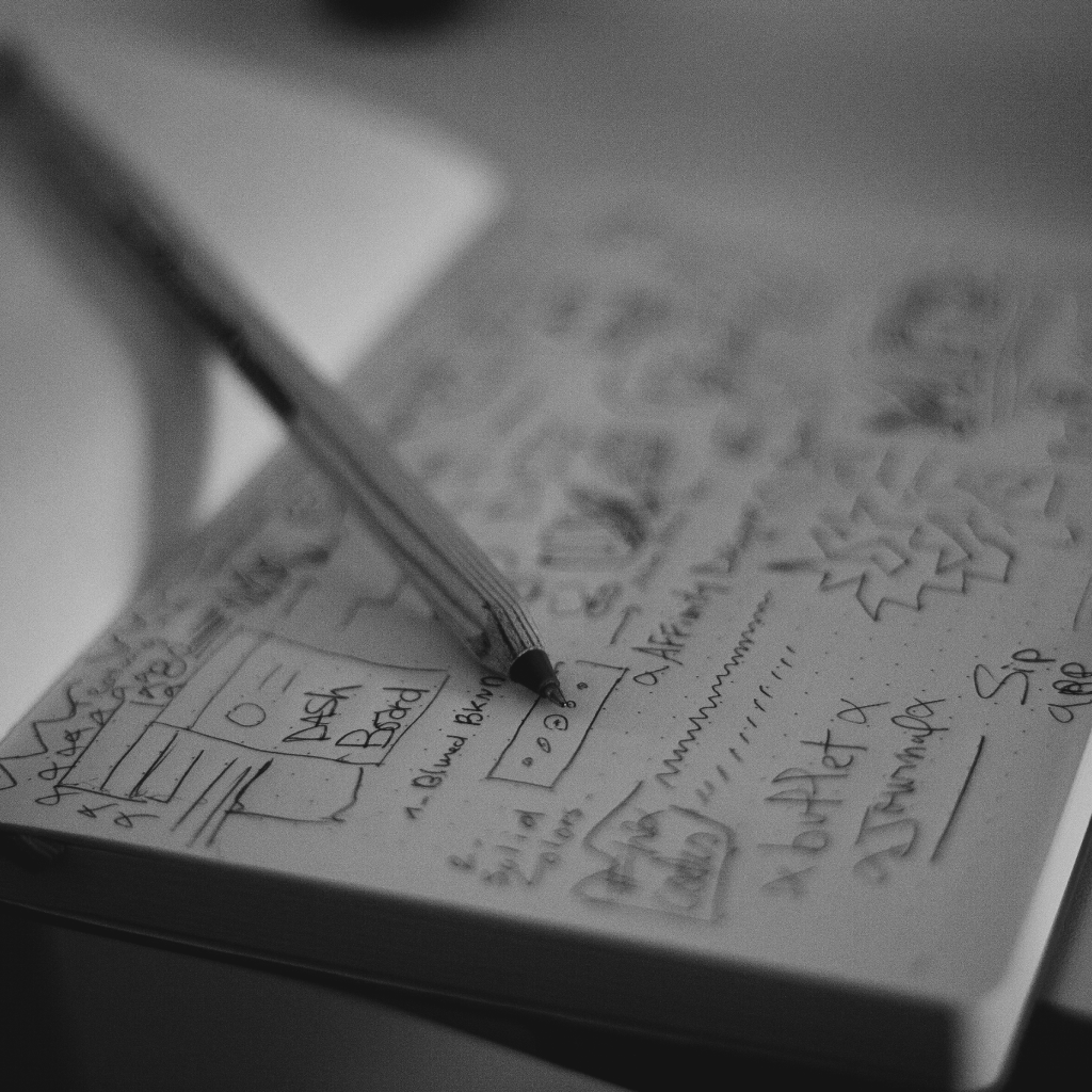
Exploring different UI design directions helps us feel out the ones that vibe better than the rest. The more design sketches you do, the more ideas you’ll get. Look & feel phase is really all about creativity and it’s important not to confine that process by anything but a time frame.
Design System
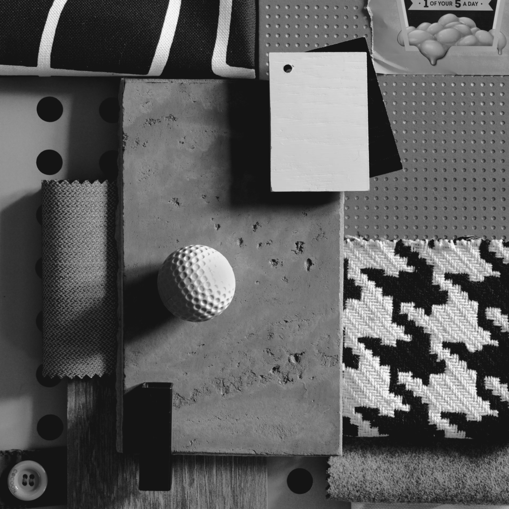
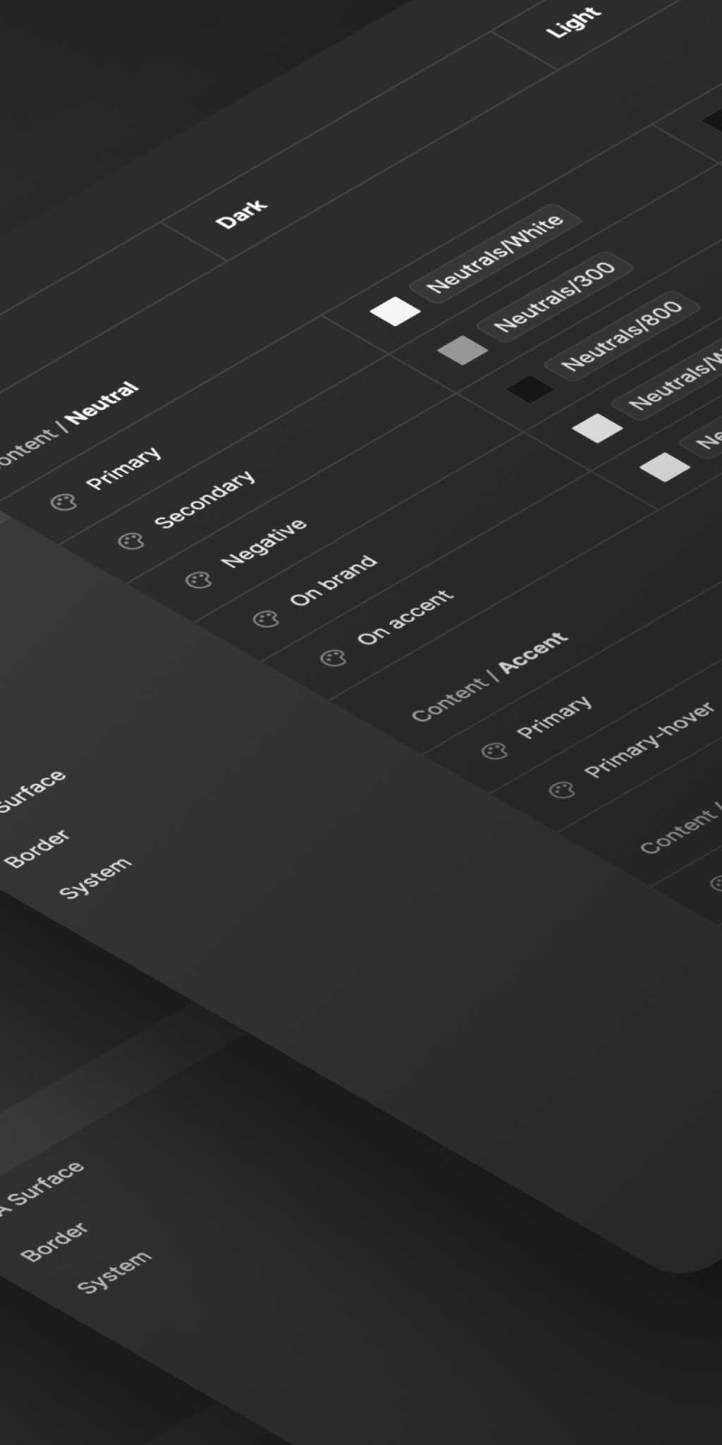
Design system provides a unified design framework which ensures streamlined digital experiences. As a customizable collaborative toolkit, it enables fast application of changes and improvements throughout the design and makes life easier for you and your current and future designers and developers. It’s not just about creating a design system, it’s about making it work for your entire team.
Related Projects
Kohler
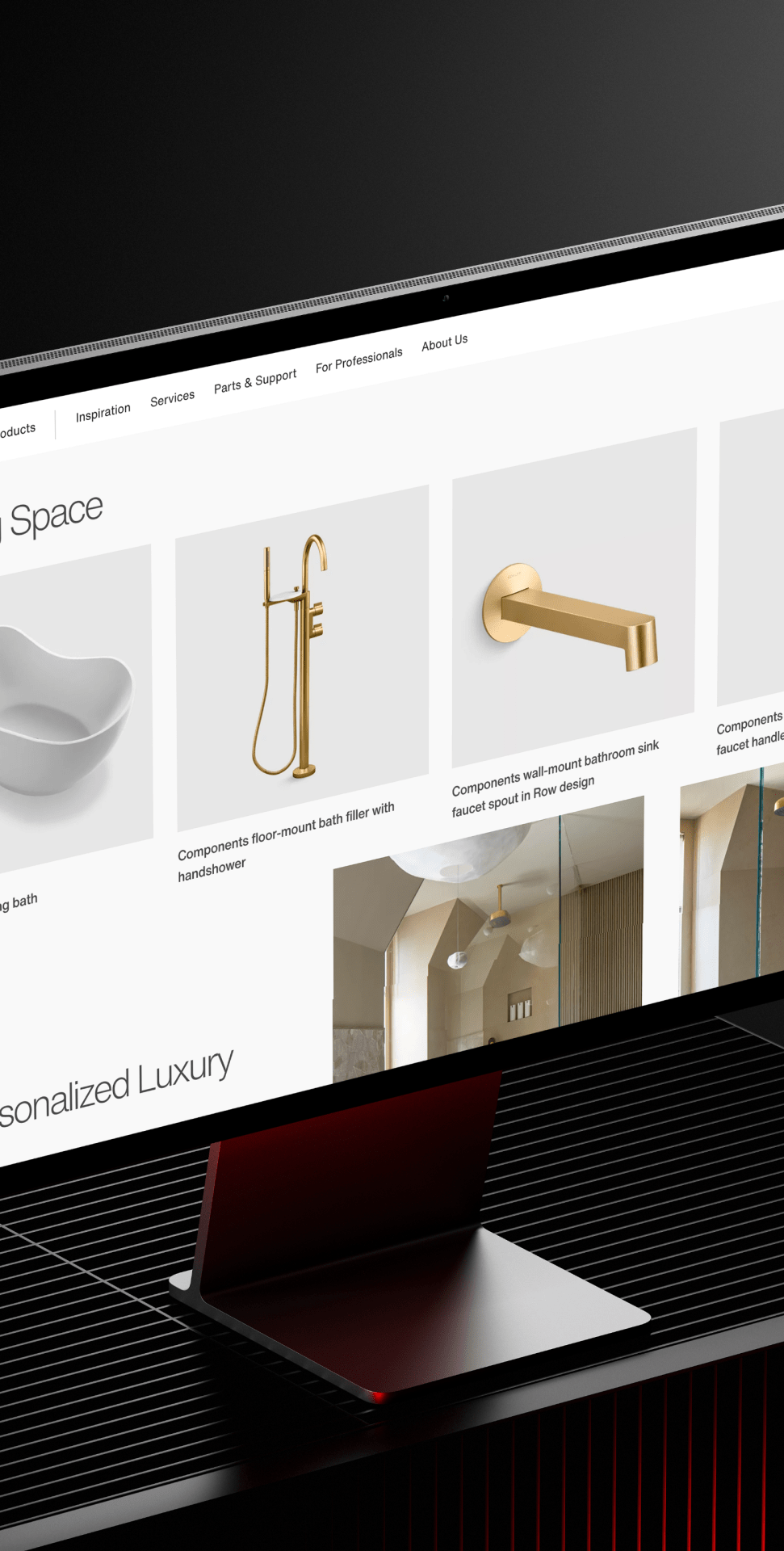
Global kitchen and bath design, manufacture, and innovation
Coming soon...

Custom Software Solutions
For many clients, seeing a product come to life through the design phase is the most exciting part of the project.
Our design methods are based on decades of experience and industry best practices.
We take a tailored approach to design so each engagement is unique to the needs of the client. There is no ‘cookie cutter’ approach to our design work.
Product Design

Moderated User Testing
A human operator facilitates a test and guides the participant, providing support and answering questions if the subject encounters challenges while completing tasks within the study. This is the kind of testing mostly used for lo-fi prototypes in an attempt to avoid any ambiguities.
User Experience Design

Information Architecture
We map out crucial information that needs to be included into the product. That gives us a blueprint of the design structure to be aggregated into wireframes and sitemaps of the project.
Wireframes
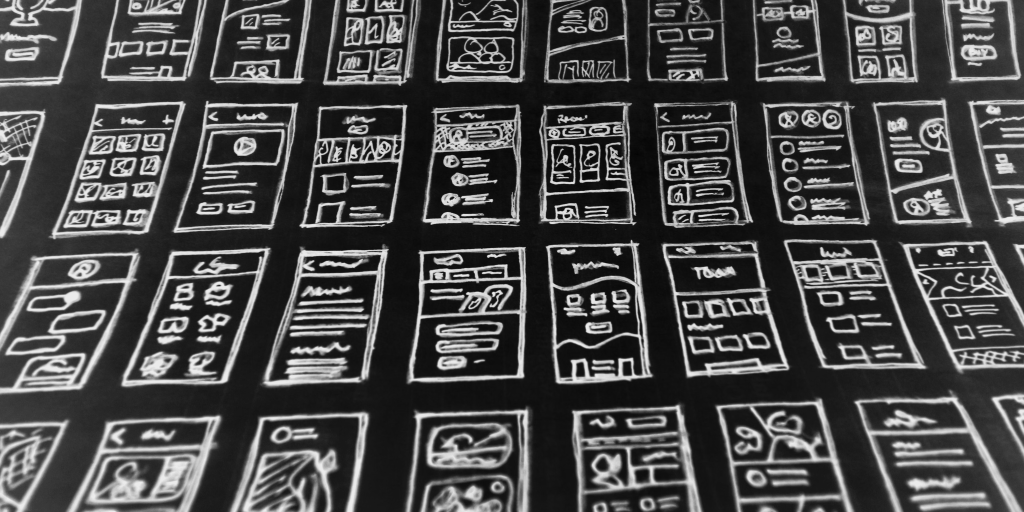
Designing a digital product at a structural level is called wireframing. A wireframe takes into account users’ needs and journeys and is commonly used to layout content and functionality of a page. Before any visual design or content is applied, we must use wireframes in order to establish the basic structure of a page.
Sitemap
The result of our efforts is a UX sitemap — a hierarchical diagram of a website or an application where everything is neatly prioritized, linked, and labeled.
User Interface Design
Design System
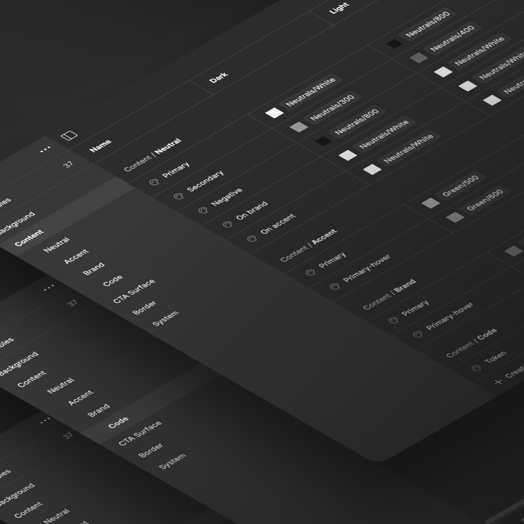
Design system provides a unified design framework which ensures streamlined digital experiences. As a customizable collaborative toolkit, it enables fast application of changes and improvements throughout the design and makes life easier for you and your current and future designers and developers. It’s not just about creating a design system, it’s about making it work for your entire team.
Related Projects

Kohler
Coming soon...
